Posts

Lab 3 [GIS6005]: Terrain Visualization
Image
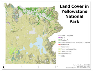
Design strategies employed while making this map included the following: Typology: Tahoma font was selected with the sizing scaled from 36 pt for the title to make it the most prominent, to 10 pt for the map supplemental information in the bottom right corner (to make it less prominent). Neatline : The neatline was drawn around the entire map area instead of the map frame to reduce whitespace overall when placing the remaining essential map elements. A border around the map frame would have made such placement less possible, with more whitespace overall around the east side of the plotted area near the jagged terrain. Color: Nonforested areas were colored gray to make them less prominent. Shades of green were selected for the Pine family of land cover, with the largest area (Lodgepole Pine) selected with lighter shading to be of sufficient visual contrast with the white background, while still falling within the hierarchical organization overall to indicate all landcover categ...

Lab 2 [GIS 6005]: Coordinate Systems

Image
The State of Wisconsin is shown above to demonstrate the appropriate selection of a coordinate system before analyzing additional attributes for a map. The State of Wisconsin falls with 3 state planes and 2 UTM zones, and thus requires the use of a custom coordinate system. The NAD 1927 Wisconsin TM (Meters) coordinate system was selected for this reason. It would not be appropriate to use either the state plane nor the UTM-based coordinate systems for this state because at best these coordinate systems would be optimal for only 33% (state plane-based) to 50% (UTM-based) of the state.

Lab 1 [GIS6005]: Map Design & Typography

Image
Recreational Areas near Austin, Texas This map highlights the importance of five design features that improve map communication: visual contrast, legibility, figure-ground organization, hieararchical organization, and balance. Visual contrast was created in this map by decreasing the shade of the Travis County area relative the symbology for main features noted in the legend. In addition, the shade used for Travis County is visually distinct from the white background used for the overall map. Legibility was achieved by carefully choosing border widths for the symbology of golf courses and hydrography. This makes most of the golf courses appear as solid areas and allows for both larger and smaller waterways to be visualized on the map. The symbol for the recreation centers was then selected to demonstrate this as a center of activity by using a circular choice for the symbol. Figure-ground organization was achieved in the inset map for the U.S. by using shading ...

FINAL PROJECT [GIS5100]: Expanding Community Engagement and Diversity in Clinical Trials in Birmingham, Alabama

Image
  Expanding Community Engagement and Diversity in Clinical Trials in Birmingham, Alabama The success of clinical trials can be improved when a diverse population representative of the population at risk for the disease being studied is engaged in the ongoing research related to that disease (Clark et al., 2019). Barriers to enrollment include distrust of being a research subject and logistical challenges, including travel time (Nissen, 2019). The urgency of addressing outcome disparity associated with new medical advances is particularly concerning in fields such as immunotherapy where knowledge of predictive biomarkers can guide optimal treatments (Nazha, 2019). Including ethnic and cultural diversity in clinical trial research can also help to address costs associated with inequitable care and better inform service planning for impacted communities (Low et al., 2019). The purpose of this final project was to examine current community engagement trends in clinical trial ...

FINAL PROJECT [GIS5027]: Locating Potential Beachrock Shelves in Dry Tortugas National Park Using Unsupervised and Supervised Classification Techniques on Aerial Imagery

Image
Locating Potential Beachrock Shelves in Dry Tortugas National Park Using Unsupervised and Supervised Classification Techniques on Aerial Imagery This final project specifically examined how unsupervised and supervised classification methods available in ERDAS Imagine could be used to locate potential beachrock shelf areas near Loggerhead Key in Dry Tortugas National Park, Florida. Near-shore beachrock shelves in this region serve as important habitats for juveniles of some fish species tolerant to the extreme conditions in these formations compared to adjacent coral reefs (Rummer et al., 2009). Monitoring of these sites is therefore relevant to understanding their importance as nurseries within reef ecosystems (Speaks et al., 2012). Automatic identification of these areas from satellite or aerial imagery avoids disturbing these sensitive habitats and can also be used for path planning the acquisition of lower cost imagery useful for continued management ( Casella et al., 2017)....

Lab 5 [GIS5027L]: Unsupervised and Supervised Classification

Image
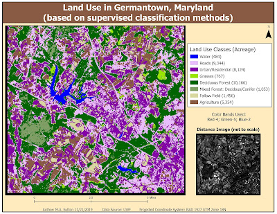
This week's lab focused on using the tools within ERDAS Imagine to perform unsupervised and supervised classification of pixels representing various features in an image. In the map above, supervised (maximum likelihood) classification was used to classify pixels based on eight different classes of land use. The results above demonstrate many urban/residential areas were misclassified within the roads class. The results can be improved by selecting more signature samples for these two classes and then also evaluating these signatures to determine the optimal 3 bands that help with differentiation prior to running the classification algorithm. Two helpful tools in ERDAS Imagine for signature evaluation include examining histogram plots and mean plots of the image bands of the features you are seeking to differentiate.

Lab 4 [GIS5027L]: Spatial Enhancement, Multispectral Data, and Band Indices

Image
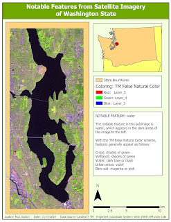
Map 1 Map 2 Map 3 The subimages above were derived from imagery from the Landsat 5 satellite. To locate the features most prominent in each of the noted areas, analysis of the histograms of the various bands was performed to locate specific peaks. Following this, each subimage was colored using a color band combination that most effectively highlighted the discovered feature with the specific histogram characteristics.  Map 1 was colored so that bodies of water would appear dark against contrasting land and urban areas. Map 2 was colored so that snow in mountainous areas would be distinghishable from surrounding areas of vegetation. Finally, Map 3 was colored to enhance shades of blue within waterways where sediment was present.

Lab 3 [GIS5027L]: Intro to ERDAS Imagine and Digital Data

Image
This week's lab introduced features within the ERDAS Imagine tool that can be utilized to understand and process satellite data. In the map above, the full-size Landsat Thematic Mapper image was loaded into ERDAS Imagine for preprocessing to crop a select region in Northwest Washington State. The attribute table within ERDAS Imagine was then supplemented with a field to determine area values for each of the land classifications in that area. After preprocessing, the image was then loaded into ArcGIS Pro to create the final layout. A focus of this week's skill development was cleaning up the formatting in the legend area to highlight only those classes relevant to the displayed image. In addition, we learned how to format the legend to include the area values that were imported into ArcGIS Pro from ERDAS Imagine.

Lab 2 [GIS5027L]: Land Use / Land Cover Classification and Accuracy Assessment

Image
This map demonstrates practice creating polygons representative of land use / land cover by examining the underlying features in the aerial photograph for details relevant to classify at Level II of the USGS Standard Land Use / Land Cover Classification System. This lab further demonstrated ways to utilize Google maps as  part of ground truthing a random set of 30 points drawn throughout the image to measure overall accuracy (shown in the map above at 70%).

Lab 1 [GIS5027L]: Visual Interpretation

Image
This map demonstrates how to identify areas of an image based on tone (brightness/ darkness) and texture (smoothness/roughness, as measured by how much the tone changes in a small area).  This map demonstrates how to use image characteristics/criteria to identify features in the image (shape and size, shadowing, patterns, and association).  This week's lab focused on various ways to visually interpret aerial photographs. By using a 5-point scale to understand tone and texture, I was able to identify areas of an image that differed by the height of the imaged features. In the next part of the lab, I learned how to include characteristics such as shape, size, shadows, pattern, and association to identify broad categories of features (e.g., neighborhoods) and specific types of features associated with this  category (e.g., residential housing).

FINAL PROJECT [GIS5050L]: Expanding Aquaculture Awareness and Utilization in Brevard County, Florida

Image
Created Using ArcGIS Pro 2.2.0 Expanding Aquaculture Awareness and Utilization in Brevard County, Florida ABSTRACT: Aquaculture is a general term encompassing the farming of aquatic organisms (animals, plants, and algae) in coastal and inland waterways. In the United States, the State of Florida ranks as one of the most highly diverse aquafarming states with sales of products for human consumption totaling millions of dollars annually. However, the economic benefits of this industry come with the risks associated with dependence on waterways that may be contaminated in both known (permitted pollution) and unknown ways (e.g., seasonal changes in water quality). Given foodborne illness risks and the demand for aquaculture expanding globally as one possible solution to food insecurity, GIS-based tools to assess the suitability of potential aquafarming selection are invaluable, especially when balancing varied stakeholder interests in managing disease spread, impact on sens...

Lab 12 [GIS5050L]: Georeferencing, Editing, & 3D

Image
Created using ArcGIS Pro 2.2.0 This week's lab covered three key skills in ArcGIS: georeferencing, editing, and overlaying data in a 3D environment. First, we learned the process to select control points for image registration, referred to as georeferencing. For the map shown on the left, this involved selecting points in the raster image and linking them to their corresponding point in a loaded vector feature class (e.g., corner of a building). Several transformations were possible based on the number of control points selected, target root mean square error (RMSE) values, and the desired appearance of the final registration (e.g., choosing a 1st or 2nd order polynomial transformation based on which one minimized RMSE or distortion).  This week's lab also emphasized editing of feature classes in the form of adding polygons and lines to existing building and road feature classes, respectively. The process of digitizing these features was based on using the outline of t...

Lab 11 [GIS5050L]: Geocoding & Network Analyst

Image
Created using ArcGIS Pro 2.2.0 This week's lab focused on best practices when geocoding data, including following the four-step process of reviewing your table of locations for the best fields to use, choosing the best locator, mapping the fields in the most efficient ways, and correctly naming your output file for the results.  Additional training emphasized how to resolve unmatched items using a combination of choosing a good basemap with street imagery, cross-searching in Google Maps, and using Select by Attributes in ArcGIS to narrow down possible matches. These skills were used in the map above to correctly place emergency management service (EMS) stations that were initially unmatched. The lab concluded with an introduction to the Network Analyst in ArcGIS to determine the best routes between several stops on this map. This is shown above for three of the EMS stations. This part of the training emphasized different ways to adjust the cost of a particular route, ...

Lab 10 [GIS5050L]: Vector Analysis, Part 2

Image
Created using ArcGIS Pro 2.2.0 This weeks lab provided an introduction to buffer analysis and overlay tools. The map above was generated based on locating intersections of great campsite locations within a specific distance of water sources and roads that were also outside of known conservation areas in De Soto National Forest in Mississippi. The lab did a great job of summarizing the relevance of variable distance buffers. In this context, the map above looked at areas within 150 meters of lakes and 500 meters of rivers. The lab also addressed how to use ArcPy to quickly perform new buffer analyses (instead of using the slower toolbox settings approach). Finally, the lab summarized the advantages of a singlepart layer compared to a multipart layer as an alternative means to more effectively explore the properties of each location in the map further.

Lab 9 [GIS5050L]: Vector Analysis, Part 1

Image
Created using ArcGIS 2.2.0 The maps above provide examples of conducting location queries in ArcGIS.  The map on the left is an example of land parcels within the City of Pensacola that are within 4000 ft of the coastline and regional rivers/water sources. On the right, I refined the query to extract from the set on the left only those land parcels that were also within 100 ft of major roads.  The training this week noted the importance of planning prior to conducting the queries to make the spatial analysis run smoothly. For example, this meant thinking about the order of the queries and whether one should return to the original data set or cascade the next processing step from the subset produced by a previous query result. I also learned  how to recognize where query results  a ppear within the navigation screens of ArcGIS and within any associated geodatabase assigned for storage.  Finally, the training this week further and clearly empha...

Labs 7-8 [GIS5050L]: Midterm Data Search

Image
  Created using ArcGIS Pro 2.2 This week's lab involved independently locating nine different sources of data sets to compose three maps highlighting various features within Brevard County, Florida. Goals of this lab included seamlessly using vector data in the form of points (e.g., cities, locations of invasive plants), lines (roads), and polygons (e.g., lake boundaries), alongside raster data (e.g., for elevations, land use, and aerial photography).  Additional skill reinforcement focused on determining a common coordinate system to project all the data, clipping each layer of data to the county boundary, and then using map frames in informative ways to create the final set of layouts. The most interesting part of the lab for me was determining how to create a theme for each map. The most challenging aspect was adjusting labeling properties within layers to reduce clutter.

Lab 6 [GIS5050L]: Projections, Part 2

Image
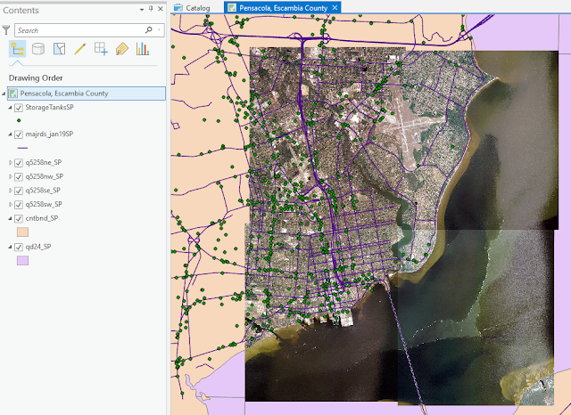
Created using ArcGIS Pro 2.2 This week's lab focused on acquiring data from a variety of online sources to create an informative set of layers for one city in Escambia County, Florida. Pensacola was selected for this. In the map above, the aerial imagery came from the Labins.org site. Overlaid on top of this are the major highways from the  Florida Geographic Data Library (FGDL) site. The green symbols represent petroleum storage tank contamination locations imported from an Excel file provided by the Florida Department of Environmental Protection site.  Skills emphasized in this lab included loading tabular data created in Excel into ArcGIS. In the example above, this involved converting geographic coordinates in degrees/minutes/seconds to decimal degrees inside Excel prior to ArcGIS loading. Additional skills emphasized in the lab included understanding the projection system of each data set when it was created and then making sure all data sets were re-proj...

Lab 5 [GIS5050L]: Introduction to Projections

Image
Created with ArcGIS Pro 2.2.0 The map above contains three data frames demonstrating three different projections of the State of Florida (Albers, UTM 16 N, and Florida State Plane 903 N). Four representative counties (Alachua, Escambia, Miami-Dade, and Polk) were selected for comparison of the associated impacts on area calculations. The table at the bottom of the image above demonstrates how area calculations for Escambia County were more closely aligned with the Albers area values given this county resides in UTM 16 N and State Plane 903 N. The remaining counties showed increasing distortion in area calculations given their locations either outside UTM 16, or State Plane 903 N, or both.

Lab 4 [GIS5050L]: ArcGIS Collector & Sharing Maps

Image
Created in ArcGIS Pro 2.2.3 The map above is an example of a story map created in ArcGIS Pro. The map is hosted at the ArcGIS Online site using this  link . The map provides the locations of 5 buildings on campus containing Automatic External Defibrillator devices. In addition, a rating of the overall quality as well as a general note about where in the building to locate the device is provided, along with an image showing the current condition of the device. The map can be improved in two ways. First, the symbology of the locations could be changed to better pinpoint the locations. When zooming in on the map, several features are also automatically colored green, so green was not a good choice for the "Like new condition". The second improvement to the map would be the legend area where the heading "AED Location" should more correctly read "Quality Assessment of AED Device".

Lab 3 [GIS5050L]: GIS & Cartography

Image
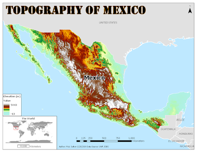
Built using ArcGIS Pro 2.0 This map shows the topology of Mexico (measured in meters) with an inset map demonstrating the placement of this country in the world setting. The color ramp selected for the elevation data was based on one of the standard ramps used for elevation inside ArcGIS. The map can be improved by selecting a lighter color blue for the background ocean information so the elevation information near the coastline is more prominent.