Lab 3 [GIS6005]: Terrain Visualization
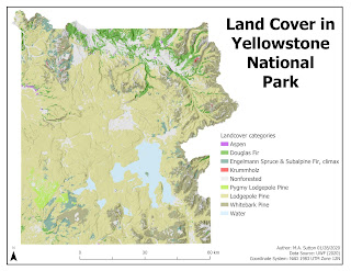
Design strategies employed while making this map included the following:
- Typology: Tahoma font was selected with the sizing scaled from 36 pt for the title to make it the most prominent, to 10 pt for the map supplemental information in the bottom right corner (to make it less prominent).
- Neatline: The neatline was drawn around the entire map area instead of the map frame to reduce whitespace overall when placing the remaining essential map elements. A border around the map frame would have made such placement less possible, with more whitespace overall around the east side of the plotted area near the jagged terrain.
- Color: Nonforested areas were colored gray to make them less prominent. Shades of green were selected for the Pine family of land cover, with the largest area (Lodgepole Pine) selected with lighter shading to be of sufficient visual contrast with the white background, while still falling within the hierarchical organization overall to indicate all landcover categories for these forested areas were equally important. Purple and red colors were selected for the Aspen and Krummholz categories to make these smaller map areas contrast with the surrounding regions in a more prominent way. Water was colored with a light shade of blue to contrast sufficiently with the other categories without indicating a higher relevance to the hierachy of all land cover categories.
- Balance: Landscape orientation was selected for this map based on the shape of the plotted region, with the legend placed to fill in whitespace due to the nonvertical shape of the east side of the region. Elements along the bottom of the map were balanced to fill white space in this area.


Comments
Post a Comment