Posts

Lab 4 [GIS5007]: Data Classification

Image
In this week's lab we examined four different classification methods for displaying data as well as alternative methods for presentation. Four classification methods were studied (Natural Breaks, Equal Interval, Quantile, and Standard Deviation) alongside two presentation styles (percentage of population and population per square mile). For the map provided above, we can determine from the histogram provided to the right, that this is a skewed, bell-shaped distribution that will make the Standard Deviation and Equal Interval methods poorer candidates for visual contrast, the latter due to the bell-shape, and the former due to the skewness. Alternatively, we can conclude that the Natural Jenks method will likely do a better job compared to the Quantile method because the former method tightens the range for the outliers while also doing a better job differentiating the values above and below the mean. When deciding which presentation better represents the distribution of se...

Lab 3 [GIS5007]: Cartographic Design

Image
This week’s lab emphasized applying Gestalt’s Principles of perceptual organization to cartographic design when creating a map highlighting locations of different types of schools within a particular ward of Washington, D.C. (Ward 7). Key software used for the map above was ArcGIS Pro, with the following special features: curved text, drop shadowing, and label customization. Two excellent web resources for these features included: Drop shadowing in ArcGIS Labeling in ArcGIS Visual hierarchy was implemented in this map in the following ways: The important map elements (school types as well as legend items for the school names) are graphically emphasized to be more prominent compared to the background city information by using larger and bolded font. The neighborhood name information providing context for the location of the schools is emphasized using a larger font and capital letters, but colored in brown to be less prominent than the school naming/type information...

Lab 2 [GIS5007] Typography: Mapping the Florida Keys

Image
This lab addressed how to create a map of Marathon, Florida and its neighboring islands using ArcGIS Pro and then export these features into Adobe Illustrator for labeling in accordance with typographic principles. Within Adobe Illustrator, key tools used including clipping, color swatches (for consistent use of colors across different features/labels), and typing on a path (for water body labels). Additional options within the Align and Layers tools were critical when designing various essential map elements, particularly the legend and scale bar. Customization to this map included the following: Type distinctions for nominal feature labels – In this case, different kinds of features were labeled using different type families (e.g., cities were labeled with Arial font whereas islands/keys were labeled with a more scripted font). This allows the viewer to more readily discern the formal areas (cities) compared to the less formal land masses (islands/keys). Type distincti...

Lab 1 Map Critique [GIS5007]: Well-designed vs. Poorly-designed Maps

Image
Map Evaluation Synopsis: Well-designed Map This map meets its intended aim to convey state-based and county-based information on the ancestry with the largest population in the provided areas. Three design principles done particularly well in this map include the following: Map Substantial Information (Tufteisms 1, 2, 3, 4, and 20) The cartographer has included a comprehensive set of ancestry labels for visualization at the state and county levels. Don’t Lie with Maps (Tufteisms 5, 6, 9, 10, 12, and 13) The cartographer has utilized the same scale in all maps with county-level data so accurate side-by-side comparisons between regions can be made. Map Layout Matters (Tufteism 19) The cartographer has effectively used the map real estate by placing map elements (e.g., the legend and data source information) in otherwise underutilized white space. Improvements to this map for consistency would include coloring all water bodies similarly (blue for oceans and for la...

Lab 1 Orientation [GIS5007]: Story Map Introduction

Image
Welcome to my Summer of the Crab Story Map Tour , located here:  https://arcg.is/1e0G0O Before joining the GIS program at UWF I used a number of freeware GIS-based tools for projects working with marine biologists and public health professionals. This story map tour shows a few of the photos I gathered in one of these projects looking for squareback crabs along Florida's shorelines. I am looking forward to enhancing the data analysis associated with this project using the skills I am acquiring this semester in Computer Cartography.

Final Project [GIS6005]: Conservation in the State of Florida: Preserving Key Habitats of the Striped Burrfish

Image
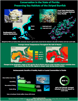
Striped burrfish are inshore fish known to exploit a wide range of depths. Although commonly found in grass beds around barrier islands in the Gulf of Mexico (Franks et al., 1972), they are also found near coral reefs (Robins, Ray, & Douglas, 1986), as well as in deeper waters during the winter months (Audubon Society, 2002). Changes to the geographic ranges of fish species due to factors such as ocean warming (Espino et al., 2019) are of concern to scientists. In addition, impacts to fish habitats in tourism-based states such as Florida are considered by economists given the socioeconomic benefits of commercial and recreational fishing to coastal communities (Lellis-Dibble, McGlynn, & Bigford, 2008). As one example of their impact, half of all federally managed fisheries in the U.S. depend on coral reefs (Burton, 2019). In addition, t he total value of coral reefs for southeast Florida was estimated in 2007 to be $174 million/year (Brander & van Beukering, 2013),...

Lab 6 [GIS6005]: Bivariate Choropleth Mapping

Image
The map above demonstrates the use of bivariate choropleth mapping to demonstrate patterns in the United States related to obesity and physical inactivity, as highlighted in the close-up of the legend provided here:  In order to prepare data for bivariate choropleth mapping, two related variables must first be normalized. In this example, the variables have been normalized using the population of each county.  Next, each variable must be independently classed into an appropriate number of bins. The quantile classification method was selected in the example above so that the data values for each of the variables were distributed in equal numbers across the data bins - this meant there were no bins with too few or too many data points. Three classes were selected for each variable in this example to intuitively align with low, medium, and high rates of of physical inactivity in a population, as well as low, medium, and high rates for obesity in a population. Th...

Lab 6 [GIS6005]: Proportional Symbol Maps for Positive and Negative Values

Image
This map uses proportional symbology to map positive and negative values. In order to achieve this within ArcGIS Pro, separate features classes representing positive ranges of values were created for the losses and for the gains.  When creating the final symbology for the two items, settings were then adjusted to make sure values noted in the legend were represented by similarly sized item on the map (i.e., same sized circle for 50K for jobs lost or jobs gained).  Finally, contrasting colors (green and orange) were then selected to help the reader visually compare states with losses and gains. A lighter border for the circles compared to the deeper shade in the interior was then used so the smallest sized items could be more easily discerned against the underlying layer with state borders, as shown in a close-up of the legend here:

Lab 5 [GIS6005]: Analytical Data

Image
Strategies employed when designing the final layout for this infographic included the following: Visual contrast: Lighter shades of blue and tan are used for areas with textual information to increase contrast with the black, blue, orange, and green fonts used in these areas. Additionally, the number of classes used for each choropleth map was selected to maximize the visual contrast between those counties with smaller percentages compared to those with large percentages. Legibility: The use of larger, bolded fonts for the “Don’t delay – get evaluated TODAY!” and “7 out of 10 diabetics have sleep disorders” textboxes was made to make these messages easily seen as the reader is scanning other supporting text provided in smaller or non-bolded fonts.  Figure-ground organization: The border around the center bar chart was thickened to make this visualization more prominent, as it demonstrates how one state (Alabama) has the three highest ranked counties for the summariz...

Lab 4 [GIS6005]: Choropleth Mapping

Image
For this map, I created a customized version of intervals after starting out with an Equal Intervals classification. I used 9 classes to capture one class for negligible changes ( ± 0-0.01%) and four classes on either side of this. I selected two bin ranges for small population changes ( ± 0-2.5% and ± 2.5-5%), one bin size for medium population changes ( ± 5-10%), and one bin size for large population changes ( ± 10-20%). The selection of four classes on either side of negligible changes was done to more clearly represent the larger range of values for growth (versus shrinkage) in population trends. I used a divergent color scheme from ColorBrewer for the legend. I used a neutral gray color for the negligible change category and then selected 4 shades of green for positive change and 4 shades of red for negative change. The colors are shaded similarly for similarly-sized histogram bins on both sides of the range, and the darkest colors in both ranges are used to indicate the...

Lab 4 [GIS6005]: Color Concepts

Image
Comparison of Color Ramps The three sequential, single-hue color ramps shown above demonstrate different methods for making a good selection of six contrasting colors.  In a linear progression (see A), the same interval within each of the RGB ranges is used for all steps. A disadvantage of this simple method is the contrast in the darker range is more difficult to discern.  One possible correction to this is to create an adjusted progression color ramp (see B), where the interval varies within each of the RGB ranges so that larger steps occur near the darker range.  Finally, use of the ColorBrewer tool (see C) is a faster alternative to creating a sequential, 6-color color ramp. In this case, the tool adjusts the steps within each RGB range to more optimally distinguish the colors at both the darker and lighter ends of the range.

Lab 3 [GIS6005]: Terrain Visualization

Image
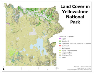
Design strategies employed while making this map included the following: Typology: Tahoma font was selected with the sizing scaled from 36 pt for the title to make it the most prominent, to 10 pt for the map supplemental information in the bottom right corner (to make it less prominent). Neatline : The neatline was drawn around the entire map area instead of the map frame to reduce whitespace overall when placing the remaining essential map elements. A border around the map frame would have made such placement less possible, with more whitespace overall around the east side of the plotted area near the jagged terrain. Color: Nonforested areas were colored gray to make them less prominent. Shades of green were selected for the Pine family of land cover, with the largest area (Lodgepole Pine) selected with lighter shading to be of sufficient visual contrast with the white background, while still falling within the hierarchical organization overall to indicate all landcover categ...

Lab 2 [GIS 6005]: Coordinate Systems

Image
The State of Wisconsin is shown above to demonstrate the appropriate selection of a coordinate system before analyzing additional attributes for a map. The State of Wisconsin falls with 3 state planes and 2 UTM zones, and thus requires the use of a custom coordinate system. The NAD 1927 Wisconsin TM (Meters) coordinate system was selected for this reason. It would not be appropriate to use either the state plane nor the UTM-based coordinate systems for this state because at best these coordinate systems would be optimal for only 33% (state plane-based) to 50% (UTM-based) of the state.

Lab 1 [GIS6005]: Map Design & Typography

Image
Recreational Areas near Austin, Texas This map highlights the importance of five design features that improve map communication: visual contrast, legibility, figure-ground organization, hieararchical organization, and balance. Visual contrast was created in this map by decreasing the shade of the Travis County area relative the symbology for main features noted in the legend. In addition, the shade used for Travis County is visually distinct from the white background used for the overall map. Legibility was achieved by carefully choosing border widths for the symbology of golf courses and hydrography. This makes most of the golf courses appear as solid areas and allows for both larger and smaller waterways to be visualized on the map. The symbol for the recreation centers was then selected to demonstrate this as a center of activity by using a circular choice for the symbol. Figure-ground organization was achieved in the inset map for the U.S. by using shading ...

FINAL PROJECT [GIS5100]: Expanding Community Engagement and Diversity in Clinical Trials in Birmingham, Alabama

Image
  Expanding Community Engagement and Diversity in Clinical Trials in Birmingham, Alabama The success of clinical trials can be improved when a diverse population representative of the population at risk for the disease being studied is engaged in the ongoing research related to that disease (Clark et al., 2019). Barriers to enrollment include distrust of being a research subject and logistical challenges, including travel time (Nissen, 2019). The urgency of addressing outcome disparity associated with new medical advances is particularly concerning in fields such as immunotherapy where knowledge of predictive biomarkers can guide optimal treatments (Nazha, 2019). Including ethnic and cultural diversity in clinical trial research can also help to address costs associated with inequitable care and better inform service planning for impacted communities (Low et al., 2019). The purpose of this final project was to examine current community engagement trends in clinical trial ...

FINAL PROJECT [GIS5027]: Locating Potential Beachrock Shelves in Dry Tortugas National Park Using Unsupervised and Supervised Classification Techniques on Aerial Imagery

Image
Locating Potential Beachrock Shelves in Dry Tortugas National Park Using Unsupervised and Supervised Classification Techniques on Aerial Imagery This final project specifically examined how unsupervised and supervised classification methods available in ERDAS Imagine could be used to locate potential beachrock shelf areas near Loggerhead Key in Dry Tortugas National Park, Florida. Near-shore beachrock shelves in this region serve as important habitats for juveniles of some fish species tolerant to the extreme conditions in these formations compared to adjacent coral reefs (Rummer et al., 2009). Monitoring of these sites is therefore relevant to understanding their importance as nurseries within reef ecosystems (Speaks et al., 2012). Automatic identification of these areas from satellite or aerial imagery avoids disturbing these sensitive habitats and can also be used for path planning the acquisition of lower cost imagery useful for continued management ( Casella et al., 2017)....

Lab 5 [GIS5027L]: Unsupervised and Supervised Classification

Image
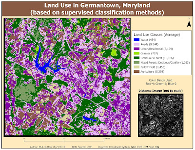
This week's lab focused on using the tools within ERDAS Imagine to perform unsupervised and supervised classification of pixels representing various features in an image. In the map above, supervised (maximum likelihood) classification was used to classify pixels based on eight different classes of land use. The results above demonstrate many urban/residential areas were misclassified within the roads class. The results can be improved by selecting more signature samples for these two classes and then also evaluating these signatures to determine the optimal 3 bands that help with differentiation prior to running the classification algorithm. Two helpful tools in ERDAS Imagine for signature evaluation include examining histogram plots and mean plots of the image bands of the features you are seeking to differentiate.

Lab 4 [GIS5027L]: Spatial Enhancement, Multispectral Data, and Band Indices

Image
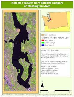
Map 1 Map 2 Map 3 The subimages above were derived from imagery from the Landsat 5 satellite. To locate the features most prominent in each of the noted areas, analysis of the histograms of the various bands was performed to locate specific peaks. Following this, each subimage was colored using a color band combination that most effectively highlighted the discovered feature with the specific histogram characteristics.  Map 1 was colored so that bodies of water would appear dark against contrasting land and urban areas. Map 2 was colored so that snow in mountainous areas would be distinghishable from surrounding areas of vegetation. Finally, Map 3 was colored to enhance shades of blue within waterways where sediment was present.

Lab 3 [GIS5027L]: Intro to ERDAS Imagine and Digital Data

Image
This week's lab introduced features within the ERDAS Imagine tool that can be utilized to understand and process satellite data. In the map above, the full-size Landsat Thematic Mapper image was loaded into ERDAS Imagine for preprocessing to crop a select region in Northwest Washington State. The attribute table within ERDAS Imagine was then supplemented with a field to determine area values for each of the land classifications in that area. After preprocessing, the image was then loaded into ArcGIS Pro to create the final layout. A focus of this week's skill development was cleaning up the formatting in the legend area to highlight only those classes relevant to the displayed image. In addition, we learned how to format the legend to include the area values that were imported into ArcGIS Pro from ERDAS Imagine.

Lab 2 [GIS5027L]: Land Use / Land Cover Classification and Accuracy Assessment

Image
This map demonstrates practice creating polygons representative of land use / land cover by examining the underlying features in the aerial photograph for details relevant to classify at Level II of the USGS Standard Land Use / Land Cover Classification System. This lab further demonstrated ways to utilize Google maps as  part of ground truthing a random set of 30 points drawn throughout the image to measure overall accuracy (shown in the map above at 70%).