Posts

Learn More from my GIS Portfolio

Image
  Hi Fellow GIS Bloggers, Today I launched my new GIS Portfolio! Check it out here: https://msutton654.wixsite.com/website This site provides some of the highlights from this blogging area, alongside some additional information about my GIS journey. The site was created using the free website builder tool called WIX. This tool does take a little bit of effort in terms of experimenting with page designs. However, the overall options provide some great choices for eye-catching layouts and creating easy to navigate pages. I look forward to exploring additional features in the future for adjusting image positions. In addition, the tool accepts video formats, and I plan to explore how to add these in future updates. Enjoy vising the link!

[GIS5945]: Virtual GIS Day!

Image
  Today I sponsored a Virtual GIS Day to explore ways to promote GIS in the future, using these sites: 101 Ways to Participate Creating and Conducting GuestPresentations for Students Promoting Your Event - particularly the section with templates for a flyer and a PowerPoint presentation During the event, attendees noted how one of the key take-aways from “Creating and Conducting Guest Presentations for Students” was the recommendation to help students consider what sets their local neighborhood apart. We discussed using a landmark familiar to students in a presentation explaining what GIS is and why it is important. For Pensacola, Graffiti Bridge was suggested. Another recommendation in the “Creating and Conducting Guest Presentations for Students” presentation was to choose a particular local or global issue and contrast maps over time to open up a discussion on the “whys of where.” In line with this and continuing with the suggested landmark theme above, we discussed how a pre...

Lab 6 [GIS5935]: Scale Effect and Spatial Data Aggregation

Image
In this lab, we examined the effects of scale and resolution on the properties of spatial data. On vector data, as scale becomes finer, we expect to see increases in the number of areas and volumes, more detail in boundaries, and more homogeneity in the features (Goodchild, 2011, pp. 6). This occurs because coarser scales (e.g., 1:100000) are more generalized, and thus a smaller number of polygons capture the most significantly sized features, while omitting smaller features. As more details are captured at finer scales (e.g., 1:1200) compared to coarser scales, geometric characteristics such as the sum of total lengths for hydrographic features will increase, based on the addition of the captured smaller features. On raster data, as resolution becomes coarser (e.g., going from 1x1m to 90x90m cells), the image becomes more smoothed, as represented by increasingly smaller average slopes as steep regions are averaged into surrounding non-steep terrain regions. Kienzle observed this whe...

Lab 5 [GIS5935]: Surface Interpolation

Image
  In this lab we examined various interpolation methods to create a surface of water quality in Tampa Bay. Each method received as input a set of sample points containing Biochemical Oxygen Demand (BOD) values in milligrams per liter that were recorded from various points throughout the study region. The interpolation methods used this case study included the following: Thiessen IDW Spline - Regularized Spline - Tension This interpolation method is a special case of IDW where only the nearest water sample is used to estimate the BOD value at an unsampled location. This interpolation method uses a preset number of nearest neighbors to estimate the BOD value at an unsampled location, and inversely weights the contributing strength of these neighbors based on their distances from the unsampled location. Spline interpolation methods work to fit a smooth surface exactly touching the BOD sampled points, w...

Lab 4 [GIS5935]: Surfaces - TINs and DEMs

Image
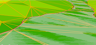
Raster-based digital elevation models (DEMs) and vector-based triangulated irregular networks (TINs) are two alternative methods to represent digital topography. A DEM is sampled at a particular resolution and can only be made more accurate if the raster is resampled to a higher resolution. Alternatively, to make a TIN more accurate, additional points and breaklines can be added. For example, in the image below, to make the sharp boundaries around a lake more accurate, the TIN has been forced to use the exact boundaries and elevation of the lake polygon (shown in red): In the enhanced TIN above, notice how the TIN grid aligns perfectly along the shoreline with the addition of many more triangular cells in this area. Additionally, more triangles appear near the bends in the shoreline to more accurately capture these details. In this lab, we also learned how contour lines differ when derived from DEMs versus TINs. We observed that contour lines generated from a DEM are much smoother in...

Lab 3 [GIS5935]: Data Quality Assessment

Image
  The goal of the accuracy assessment summarized in the map above was to determine quality of road networks provided by Jackson County GIS compared to a data set provided by the U.S. Census Bureau. One measure of such quality is the completeness of the data set, or how comprehensive the coverage of the data set is. As noted by Haklay (2010, pp. 690-692), one method to make this comparison between two data sets of road networks involves overlaying a grid over the study area and then calculating the difference in the total length of line segments in each cell. To get a percentage, one of the data sets serves as the base (in this case, the Jackson County GIS data set served this purpose). The calculated percentage can then be positive or negative based on this formula:      % difference = 100% * (Jackson County GIS - U.S. Census Bureau)/Jackson County GIS A positive value indicates better coverage by Jackson County GIS in the underlying grid cell (noted by shad...

Professional outreach with GISCorps

Image
For ongoing professional engagement I have selected GISCorps , a volunteer-based group which operates under the Urban and Regional Information Systems Association, an international non-profit that promotes "the effective and ethical use of spatial information and information technologies for the understanding and management of urban and regional systems." Becoming a "Friend" to GISCorps is free and allows you to receive their quarterly newsletter and announcements about developments within GISCorps, including the amazing work of their volunteers. Alternatively, if you are ready to use your GIS and geospatial expertise to help communities in need, you can register for free as a "Volunteer". Joining GISCorps with this level means you’ll be notified of volunteer opportunities that match your skills, and then you follow-up with an application. This level of participation includes agreeing to a GIS Service Pledge that includes a commitment from Esri for a d...

Lab 2 [GIS5935]: Data Quality Standards

Image
  The image above shows 20 test point locations across a street map for the city of Albuquerque. In selecting these test points to report the horizontal accuracy of two alternative geographic data sources providing street centerlines, the following constraints were applied, in compliance with using the National Standard for Spatial Data Accuracy to measure and report the associated quality (Minnesota Planning Land Management Information Center, 2019): Locations were selected using street intersections derived from orthophotos of the study area - these images contained detailed imagery of street centerlines and nearby features (e.g., medians, sidewalks) that could be readily used to accurately determine intersection points. Given the street uniformity throughout the region, approximately 25% of the points were derived from each quadrant of the overall study area, and all quadrants were equally represented in this way (meeting the requirement to draw at least 20% of test points from ...

Lab 1 [GIS5935]: Calculating Metrics for Spatial Data Quality

Image
  Precision provides an assessment of the consistency of a measurement method (Bolstad, 2016, p. 624), or how close the measured values are to each other. The most commonly used measurement of precision is the distance that includes 68% of the repeated observations. For this dataset, as noted in the map legend above, the 68% horizontal precision value is 4.5 m. This means that 68% of independent observations are within 4.5 m of the average location. Alternatively, accuracy provides an assessment of how close a value is to the true value (Bolstad, 2016, p. 624). In this lab, horizontal accuracy was estimated as the distance between the average location and a known reference point, and was determined to be approximately 3.25 m.  With horizontal accuracy estimated as 3.25 m and 68% horizontal precision estimated as 4.5 m, we note a significant difference of 1.25 m between these values. Using a 68% horizontal precision value estimate means there are still 32% of the observations t...

Lab 6 [GIS6105]: Interpolation

Image
Estimating the values for chlorophyll a across the tessellated grid using inverse distance weighting (IDW) involved examining the average measurements of chlorophyll a taken from the four sample sites over a two-month window and then weighting these values based on the distance of these sample sites from each grid cell (Bolstad, 2005). For this case study, I selected parameters for the tessellated surface to create square-shaped grid cells (creating a more uniform visualization for the grid). IDW is a spatial interpolation method well-suited to this application due to the ease of implementation, the speed of the calculation, and the assumption within this case study that the neighborhood of known sites captures relevant local information that should impact each grid cell in the tessellation (i.e., we are assuming no significant outliers). In this example, all sample sites are also in the same waterway, and we are relying on the assumption that there are no barriers to water flow that...

Lab 5 [GIS6105]: Tessellation

Image
  The final map I created in this lab includes some preliminary analysis of the differences in average dissolved oxygen levels as a side-by-side comparison for January 2014 versus February 2014. In this example I used graduated symbols colored red (dangerous level), yellow (warning level), and green (acceptable level). This provides visual cues on areas within Bayou Texar that may be at risk for water quality issues. A tessellated surface for this feature would be very useful to show the scope of the impact of the change in values from the northern to southern regions of this waterway. For example, for the results from January 2014, the tessellated cells colored near the northernmost site could provide guidance on how far in this area community groups could explore for potential contributing causes. Tessellated surfaces would also be beneficial for examining temperature-related data for this case study, as well as other environmental impact case studies where water temperature/qual...

Lab 6 [GIS5103]: Working with Geometries

Image
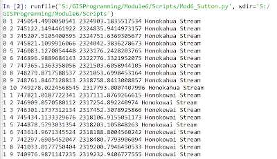
The screenshot above shows the output from this week's lab where skills emphasizing working with geometry objects were addressed. In the output above these skills were used to read a shapefile and then write specific information on each feature to a text file. The items on each line in the output file included the object ID number, vertex count number, X coordinate, Y coordinate, and feature name. The general pseudocode was as follows: Start     Step 0: (Setup)     Setup input filepath     Setup output filepath     Step 1: (Prepare output file)     Create output filename     Open output file for writing      Step 2: (Write details to output file)     Create search cursor to extract OID@, SHAPE@, NAME for each feature     Iterate through each row/feature in cursor         Set vertexID to 0 ...

Lab 5 [GIS5103]: Exploring and Manipulating Data

Image
The screenshots above represent the output from a multi-part Python script that performs the following steps: Step 1: Create and initialize a new geodatabase Step 2: Create a Search Cursor for cities associated with county seats Step 3: Create and initialize a dictionary for cities associated with county seats The initial pseudocode for these script requirements included: START     Step 1:             Setup filepath naming     Create new geodatabase     Iterate over features in Data:          Copy feature from Data folder into new geodatabase          Print name of copied feature to screen     Step 2:     Setup filepath naming     Setup field list of specific attributes within cities feature (NAME, FEATURE, POP_2000)   ...

Lab 4 [GIS5103]: Geoprocessing

Image
The screenshot above provides the output from a Python script created this week to process a shapefile containing the locations of hospitals around the University of Texas at Austin, as shown here for part of this map: A 1000-meter buffer was created around each hospital location, and then these overlapping buffer regions were dissolved into a separate, single feature, as shown here for the final output around the same area shown above: An overview of the major steps in the overall workflow is provided here: Overview of Major Steps in Overall Workflow: STEP 0 : verify licensing, extensions, and input file hospitals.shp available STEP 1 : hospitals.shp à add XY coordinates à produce hospitalsXY.shp STEP 2 : hospitalsXY.shp à perform buffering à produce hospitalsXY_buffered.shp STEP 3 : hospitalsXY_buffered.shp à perform dissolving à produce hospitalsXY_buffered_dissolved.shp Key ArcPy functions explored this week for error handling ...

Lab 3 [GIS5103]: Debugging and Error Handling

Image
In this week's lab we examined the templates for three separate Python scripts to identify syntax errors and exceptions and how best to locate these using Spyder. The output from the first script that prints out the names of fields from a shapefile is shown here: Identifying the syntax errors within this script emphasized the importance of consistency with variable naming and the correct format for iterating with a for loop. The second script was designed to display a more complete set of items from an ArcGIS project file, including spatial reference information and layer information, as shown here: Systematically identifying the syntax errors in this script emphasized the importance of file path naming and consistency with variable name capitalization, as well as understanding the relevance of correctly formatting and spelling method names. A third and final script provided training in using the try-except statement, as shown in the following flowchart: ...

Lab 2 [GIS5103]: Python Fundamentals

Image
Output from Module 2 Python script This week's lab focused on practicing with data types and fundamental constructs in the Python scripting language, including for and while loops, as well as  if statements. I examined the differences between  functions  and methods , and I additionally learned how to work with lists, strings, and numbers in Python.  The output shown above is for a Python script that performed these tasks: Step 1: Print the last element of a list containing a full name. Step 2: Display the dice rolls of a set of players and their  game status (win, lose, or tie). Step 3: Create a list of 20 random numbers in the range 0 to 10. Step 4: Remove a preset number from a list. A flowchart I sketched as part of Step 4 is shown here: In this case, I have two variables that I initialize prior to entering the while loop. Within the while loop, I continue to remove the preset number from the list based on the number of ...

Lab 1 [GIS5103]: Introducing Python

Image
The screenshot above provides the result of running my first Python script (based on Python version 3.6.8) to automatically generate folders that will be used this semester for organizing the data, scripts, and results in each module of GIS5103 GIS Programming. One of the main take-aways from the lab this week was interpreting " The Zen of Python ", written by Tim Peters, which I summarized as follows: "The Zen of Python" provides 19 guiding principles to consider when writing Python code. A recurring theme across the principles is that LOOKS MATTER – we should strive to write code that is easy to decipher and read. If there is a simple versus clever way to write the code, we should stick with the simple and explicit version, and we should follow this principle with each line of code (i.e., multiple lines of code that are easy to read are better than one complex line). We should also choose variable names that make reading the code easier (e.g., use a variable ...

Lab 7 [PHC5007]: Google Earth

Image
This week's lab utilized ArcGIS Pro and Google Earth Pro to explore and create interactive 3D maps and develop a recorded video tour.  The first objective of the lab was to learn how to use ArcGIS Pro to create KML files, and then import these files into Google Earth Pro to create the map provided above. The screenshot to the right shows how the final layers of data appeared in Google Earth Pro, alongside an image of a legend that was manually added to the map to help with interpretation.  The second objective of the lab was to create a set of placemarks on this map traveling from Miami to Tampa and then compile a tour of these placemarks using various viewing angles, data layers, and associated features (e.g., pop-up attributes). The screenshot to the left shows how these layers of data appeared in Google Earth Pro. This part of the lab also showcased how to explore various 3D buildings and photorealistic enhancements in some cities. For example, Tampa was explored...

Lab 6 [GIS5007]: Isarithmic Mapping

Image
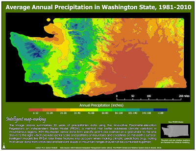
This week's lab focused on working with continuous raster data and exploring isarithmic mapping techniques that can be used to enhance the overall data visualization. Thematic maps based on continuous tone and hypsometric tinting were created, with the final map provided above created using ArcGIS Pro. In this final map, hypsometric tinting is implemented by manually classifying the average annual precipitation values at each point into 10 classes, beginning with ≤10 inches, 11-20 inches, and continuing through 141-180 inches, and finally, >180 inches. The final shading began with red for the lowest values and ramped up to deep blue for the higher values. Although it takes time to create the meaningful intervals for this type of visualization, this map demonstrates how symbolization based on hypsometric tinting is well-suited when you want to display a more 3D-like image that reflects changes associated with another phenomenon (in this case, changes in elevation). It is a...

Lab 5 [GIS5007]: Choropleth and Proportional Symbol Mapping

Image
This week's lab used both ArcGIS Pro and Adobe Illustrator to address a number of important considerations when designing maps, including the significance of using an appropriate projection (equal area) with choropleth map visualizations for population densities and factors to consider when selecting various classification schemes for data sets. For the data set above, the projection used is Europe Albers Equal Area Conic. This projection is particularly useful for choropleth mapping because it preserves area, which is critical when mapping densities. In this particular lab, we are mapping population density per unit area across European countries. Given this, it is critical to have a projection optimized at the continental scale so the unit area looks the same size across this region. To communicate the map theme, two different classification schemes are employed in this map, with classes selected to maximize overall contrast. This map uses the Quantile classification...