Posts

Showing posts from February, 2019

Lab 6 [GIS5050L]: Projections, Part 2
Image
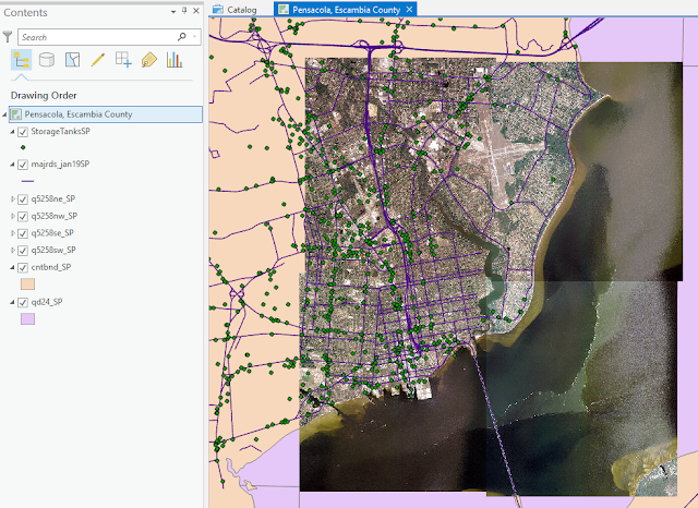
Created using ArcGIS Pro 2.2 This week's lab focused on acquiring data from a variety of online sources to create an informative set of layers for one city in Escambia County, Florida. Pensacola was selected for this. In the map above, the aerial imagery came from the Labins.org site. Overlaid on top of this are the major highways from the  Florida Geographic Data Library (FGDL) site. The green symbols represent petroleum storage tank contamination locations imported from an Excel file provided by the Florida Department of Environmental Protection site.  Skills emphasized in this lab included loading tabular data created in Excel into ArcGIS. In the example above, this involved converting geographic coordinates in degrees/minutes/seconds to decimal degrees inside Excel prior to ArcGIS loading. Additional skills emphasized in the lab included understanding the projection system of each data set when it was created and then making sure all data sets were re-proj...

Lab 5 [GIS5050L]: Introduction to Projections

Image
Created with ArcGIS Pro 2.2.0 The map above contains three data frames demonstrating three different projections of the State of Florida (Albers, UTM 16 N, and Florida State Plane 903 N). Four representative counties (Alachua, Escambia, Miami-Dade, and Polk) were selected for comparison of the associated impacts on area calculations. The table at the bottom of the image above demonstrates how area calculations for Escambia County were more closely aligned with the Albers area values given this county resides in UTM 16 N and State Plane 903 N. The remaining counties showed increasing distortion in area calculations given their locations either outside UTM 16, or State Plane 903 N, or both.

Lab 4 [GIS5050L]: ArcGIS Collector & Sharing Maps

Image
Created in ArcGIS Pro 2.2.3 The map above is an example of a story map created in ArcGIS Pro. The map is hosted at the ArcGIS Online site using this  link . The map provides the locations of 5 buildings on campus containing Automatic External Defibrillator devices. In addition, a rating of the overall quality as well as a general note about where in the building to locate the device is provided, along with an image showing the current condition of the device. The map can be improved in two ways. First, the symbology of the locations could be changed to better pinpoint the locations. When zooming in on the map, several features are also automatically colored green, so green was not a good choice for the "Like new condition". The second improvement to the map would be the legend area where the heading "AED Location" should more correctly read "Quality Assessment of AED Device".