Posts

Showing posts from April, 2020

Lab 7 [PHC5007]: Google Earth

Image
This week's lab utilized ArcGIS Pro and Google Earth Pro to explore and create interactive 3D maps and develop a recorded video tour.  The first objective of the lab was to learn how to use ArcGIS Pro to create KML files, and then import these files into Google Earth Pro to create the map provided above. The screenshot to the right shows how the final layers of data appeared in Google Earth Pro, alongside an image of a legend that was manually added to the map to help with interpretation.  The second objective of the lab was to create a set of placemarks on this map traveling from Miami to Tampa and then compile a tour of these placemarks using various viewing angles, data layers, and associated features (e.g., pop-up attributes). The screenshot to the left shows how these layers of data appeared in Google Earth Pro. This part of the lab also showcased how to explore various 3D buildings and photorealistic enhancements in some cities. For example, Tampa was explored for

Lab 6 [GIS5007]: Isarithmic Mapping

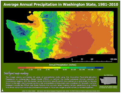
Image
This week's lab focused on working with continuous raster data and exploring isarithmic mapping techniques that can be used to enhance the overall data visualization. Thematic maps based on continuous tone and hypsometric tinting were created, with the final map provided above created using ArcGIS Pro. In this final map, hypsometric tinting is implemented by manually classifying the average annual precipitation values at each point into 10 classes, beginning with ≤10 inches, 11-20 inches, and continuing through 141-180 inches, and finally, >180 inches. The final shading began with red for the lowest values and ramped up to deep blue for the higher values. Although it takes time to create the meaningful intervals for this type of visualization, this map demonstrates how symbolization based on hypsometric tinting is well-suited when you want to display a more 3D-like image that reflects changes associated with another phenomenon (in this case, changes in elevation). It is a

Lab 5 [GIS5007]: Choropleth and Proportional Symbol Mapping

Image
This week's lab used both ArcGIS Pro and Adobe Illustrator to address a number of important considerations when designing maps, including the significance of using an appropriate projection (equal area) with choropleth map visualizations for population densities and factors to consider when selecting various classification schemes for data sets. For the data set above, the projection used is Europe Albers Equal Area Conic. This projection is particularly useful for choropleth mapping because it preserves area, which is critical when mapping densities. In this particular lab, we are mapping population density per unit area across European countries. Given this, it is critical to have a projection optimized at the continental scale so the unit area looks the same size across this region. To communicate the map theme, two different classification schemes are employed in this map, with classes selected to maximize overall contrast. This map uses the Quantile classification meth

Lab 4 [GIS5007]: Data Classification

Image
In this week's lab we examined four different classification methods for displaying data as well as alternative methods for presentation. Four classification methods were studied (Natural Breaks, Equal Interval, Quantile, and Standard Deviation) alongside two presentation styles (percentage of population and population per square mile). For the map provided above, we can determine from the histogram provided to the right, that this is a skewed, bell-shaped distribution that will make the Standard Deviation and Equal Interval methods poorer candidates for visual contrast, the latter due to the bell-shape, and the former due to the skewness. Alternatively, we can conclude that the Natural Jenks method will likely do a better job compared to the Quantile method because the former method tightens the range for the outliers while also doing a better job differentiating the values above and below the mean. When deciding which presentation better represents the distribution of se

Lab 3 [GIS5007]: Cartographic Design

Image
This week’s lab emphasized applying Gestalt’s Principles of perceptual organization to cartographic design when creating a map highlighting locations of different types of schools within a particular ward of Washington, D.C. (Ward 7). Key software used for the map above was ArcGIS Pro, with the following special features: curved text, drop shadowing, and label customization. Two excellent web resources for these features included: Drop shadowing in ArcGIS Labeling in ArcGIS Visual hierarchy was implemented in this map in the following ways: The important map elements (school types as well as legend items for the school names) are graphically emphasized to be more prominent compared to the background city information by using larger and bolded font. The neighborhood name information providing context for the location of the schools is emphasized using a larger font and capital letters, but colored in brown to be less prominent than the school naming/type information